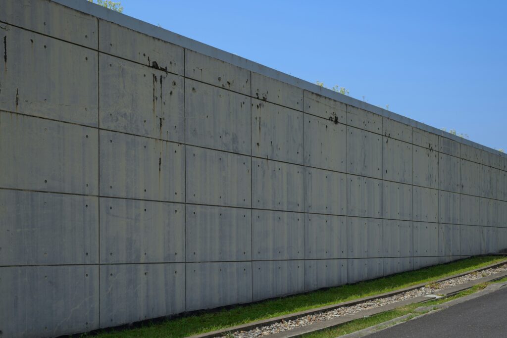
Why Statement Walls Matter
One wall. That’s all it takes to shift a room from forgettable to striking. Statement walls work fast—they anchor the eye and give a space instant character without tearing everything down or starting from scratch. Paint it bold, paper it wild, or throw up a mural—suddenly, the room tells a story.
They’re also a shortcut to showing off some personality. Maybe you’re into clean lines with sharp colors. Maybe it’s vintage florals or gritty industrial textures. Whatever your thing is, you don’t need to redo the entire room to express it. A single wall gets the job done.
Open layouts especially benefit. In big, undefined spaces, a statement wall draws invisible boundaries. It can split the work area from the relaxation zone, or turn a breakfast nook into its own moment. Smart design doesn’t need to be loud. But it can be sharp—and fast.
Choosing the Right Wall
Not every wall deserves the spotlight. Go for the ones that naturally draw the eye—behind the bed, backing the sofa, or anchoring a dining area. These spots already act as visual centerpieces, so adding color or pattern there feels intentional, not chaotic.
But know when to stop. If you’re working with a room that already has a lot going on—big furniture, open shelving, bold floors—layering on a loud wall can tip you into overload fast. The goal is to elevate, not overwhelm. If it starts feeling busy, it probably is.
Architecture can also do some of the heavy lifting. Alcoves, fireplaces, even short dividing walls are built-in focal points begging for a bold move. Use them. These features already carve out mini-stages within your space—it just makes sense to dress them up.
Bold Patterns: What Works Now
Right now, it’s all about visual confidence. Geometrics are back—but cleaner, less busy. Think oversized grids, angular layouts, and ‘80s-inspired symmetry, stripped down. Botanicals lean toward the lush and painterly, not the delicate florals we’ve seen before. Bold jungle fronds, oversized blooms, and hand-sketched vines that look like artwork. Abstract murals? Still on the rise, often custom or wallpapered, with broad brushstrokes or color fields that echo modern art.
Pattern size matters more than people think. Large-scale prints open up a space, giving it an expansive, gallery-like feel. Smaller repeats add pulse and intimacy—ideal for tight spots like powder rooms or breakfast nooks. Don’t ignore rhythm: patterns with a too-tight repeat can feel frantic, while designs that breathe make a room calmer.
Blending patterns with the rest of the room is where most people trip. The key is balance. If your statement wall is loud, pull back on everything else. Neutral furniture, toned-down fabrics, clean lines. Or, if your pattern’s more abstract or tonal, you’ve got more room to play—layer in textures, repeat one or two accent colors across cushions, art, or rugs. It’s not about matching—it’s about intention and restraint.
Power of Color
Color is more than a visual choice—it’s emotional, spatial, and deeply tied to personal style. When used strategically, bold color can anchor a room just as powerfully as pattern.
Choosing Saturation: Loud vs. Low-Key
Bold walls don’t always mean high volume. The key is understanding how saturation changes the mood of a space:
– High-saturation hues like cobalt blue, fiery coral, or emerald instantly energize a room and command attention.
– Muted shades offer richness without overwhelming. Think soft olive green, dusty rose, or charcoal navy.
Tip: Go saturated for bold personality, go muted for timeless sophistication.
Lighting: The Hidden Influencer
Natural light has a big say in how color behaves inside your home:
– Bright morning light can intensify warm colors like reds, oranges, and yellows.
– Afternoon shade tends to cool everything down, muting vibrant shades into darker tones.
– South-facing rooms can handle bolder hues, while north-facing rooms might benefit from warmer or lighter tones for balance.
Always sample paint or wallpaper during different times of day before making a final decision.
Color Pairings That Surprise and Succeed
Some combinations you wouldn’t expect are quickly becoming interior designer favorites:
– Rust + Lavender: Earthy groundedness meets ethereal calm—works beautifully in relaxed living spaces.
– Navy + Mustard: Bold yet balanced, this duo gives structure and warmth without overwhelming the eye.
These unexpected pairings offer unique depth and tension—perfect for a statement wall that surprises without clashing.
Let colors collaborate, not compete. A well-chosen palette activates the space, rather than just decorating it.
Materials Matter
When it comes to statement walls, what you put on the wall matters just as much as the color or pattern you choose. Paint is the go-to for flexibility and budget. It’s easy to refresh, beginner-friendly, and good for those who like to switch things up often. Matte, satin, or semi-gloss—each finish changes how the wall feels.
Wallpaper, on the other hand, brings in instant impact. Bold prints, metallics, and textures can all live here. Peel-and-stick options have made this more DIY than ever, though traditional paste-on varieties still tend to deliver a more polished, long-term look. Just know your limits—lined patterns, corners, and matching seams can push some installs into pro-only territory.
Textured panels are the heavy hitters. Think wood slats, 3D tiles, or acoustic felt. They bring depth, shadow play, and tactile appeal, but they also often require tools, precise measuring, and sometimes a second set of hands. Definitely more investment, but the payoff is high.
Performance comes into play depending on the space. For high-traffic zones, scrubbable paint and durable wallpaper coatings are a must. In kid-heavy areas? Avoid anything too delicate or high-maintenance. Bathrooms need humidity-friendly materials—think mildew-resistant paints or vinyl wallpapers.
Bottom line: your material choice should match your space, skill level, budget, and how big of a statement you’re really ready to make.
Balancing Drama with Design
A statement wall doesn’t care whether your space leans minimal or maximal. It just needs intention. In minimal rooms, a bold wall can do the heavy lifting—one burst of pattern or color gives all the energy without needing to clutter the space. The key here is restraint everywhere else. If your wall is loud, your furniture, textiles, and accessories should tread lightly. Think: concrete floors, a crisp white sofa, and then—boom—a forest green mural with abstract lines behind it.
In maximalist spaces, it’s more about fit than contrast. Your statement wall should sync with the rest of the room rather than fight it. That might mean pulling a pattern from a vintage rug and blowing it up on wallpaper, or echoing a color that’s used in smaller doses elsewhere. The room stays layered, but intentional.
Not sure how to walk that line? Start by anchoring the wall with one or two colors already present in the room. From there, play with pattern or texture that adds complexity without rewriting what’s already working. Use the wall as a story extension—not a plot twist.
For more ideas on how to expertly balance these styles, check out this guide: Mixing Minimalism and Maximalism for Unique Rooms.
Mistakes to Avoid
Going big without a strategy is where most statement walls start to fail. It’s tempting to chase that wow factor—you see a deep teal mural or a gold-leaf accent wall on social and think, “why not me?” But without a broader plan, bold becomes busy fast. Your wall doesn’t exist in a vacuum. It needs to echo the room’s function, layout, and mood.
Hype is another trap. Just because a pattern or palette is trending doesn’t mean it belongs in your space. Harmony over hashtags. If the rest of your room leans soft and natural, dropping in a loud checkerboard or neon gradient can feel off. It turns your wall into a distraction instead of a feature.
Then there’s the long game. That graphic you love now might feel tired in six months. Ask yourself if you’ll be fine waking up to it every day. Does it flex as your style evolves? Treat it like a semi-permanent backdrop, not a passing mood. Statement walls should be bold, yes—but also smart, grounded, and able to grow with your space.
Final Thoughts
A statement wall isn’t just an on-trend design move—it’s a deliberate tool. It sets the tone of a room before you even speak. When done right, it’s a quiet flex. It tells people you know what you’re doing without needing to say a word.
But confidence doesn’t mean chaos. Loud color or bold pattern is only powerful when it’s anchored with intention. Random choices pile up fast and can leave a space feeling jittery, not energized. The goal isn’t to shock. It’s to resonate.
At the end of the day, your space should move you. If the wall doesn’t make you feel something—calm, joy, ambition—go back to the drawing board. Trends come and go, but how a room makes you feel? That sticks.


 Ask Gavryth Lornquill how they got into home improvement news and you'll probably get a longer answer than you expected. The short version: Gavryth started doing it, got genuinely hooked, and at some point realized they had accumulated enough hard-won knowledge that it would be a waste not to share it. So they started writing.
What makes Gavryth worth reading is that they skips the obvious stuff. Nobody needs another surface-level take on Home Improvement News, Home Renovation Hacks, DIY Project Ideas. What readers actually want is the nuance — the part that only becomes clear after you've made a few mistakes and figured out why. That's the territory Gavryth operates in. The writing is direct, occasionally blunt, and always built around what's actually true rather than what sounds good in an article. They has little patience for filler, which means they's pieces tend to be denser with real information than the average post on the same subject.
Gavryth doesn't write to impress anyone. They writes because they has things to say that they genuinely thinks people should hear. That motivation — basic as it sounds — produces something noticeably different from content written for clicks or word count. Readers pick up on it. The comments on Gavryth's work tend to reflect that.
